准备开发环境
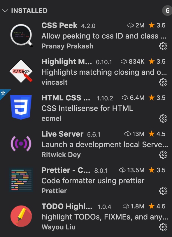
开发工具: vscode
插件
photoshop: 用于查看设计图稿字体,字体大小,间距
从设计图稿入手,寻找组件
横向列表:

纵向列表
卡片

徽标

输入框

按钮

区块

标题
媒体

定义主颜色集
:root {
  --color-primary: #2584ff;
  --color-secondary: #00d9ff;
  --color-accent: #ff3400;
  --color-headings: #1b0760;
  --color-body: #918ca4;
  --color-body-darker: #5c5577;
  --color-border: #ccc;
  --border-radius: 30px;
}
使用方式: background: var(--color-primary);
方便统一管理页面配色
盒子模型
*,
*::after,
*::before {
  box-sizing: border-box;
}
统一盒子模型
排版
<link rel="stylesheet" href="css/normalize.css">
/* Typography */
::selection {
  background: var(--color-primary);
  color: #fff;
}
html {
  font-family: Inter, Arial, Helvetica, sans-serif;

  /* 62.6 of 16px = 10px */
  font-size: 62.5%;
}

body {
  color: var(--color-body);
  font-size: 2.4rem;
  line-height: 1.5;
}

h1,
h2,
h3 {
  color: var(--color-headings);
  margin-bottom: 1rem;
  line-height: 1.1;
}

h1 {
  font-size: 7rem;
}

h2 {
  font-size: 4rem;
  font-weight: 500;
}

h3 {
  font-size: 3rem;
}

p {
  margin-top: 0px;
}

@media screen and (min-width: 1024px) {
  body {
    font-size: 1.8rem;
  }

  h1 {
    font-size: 8rem;
  }

  h2 {
    font-size: 4rem;
  }

  h3 {
    font-size: 2rem;
  }
}
link组件
/* Links */
a {
  text-decoration: none;
}

.link-arrow {
  color: var(--color-accent);
  text-transform: uppercase;
  font-size: 2rem;
  font-weight: bold;
}

.link-arrow::after {
  content: "-->";
  margin-left: 5px;
  transition: margin 0.15s;
}

.link-arrow:hover::after {
  margin-left: 10px;
}

@media screen and (min-width: 1024px) {
  .link-arrow {
    font-size: 1.5rem;
  }
}
Badges组件
/* Badges */
.badge {
  border-radius: 20px;
  padding: 0.5rem 2rem;
  font-weight: 600;
  white-space: nowrap;
  font-size: 2rem;
}

.badge--primary {
  background: var(--color-primary);
  color: #fff;
}

.badge--secondary {
  background: var(--color-secondary);
  color: white;
}

.badge--small {
  font-size: 1.6rem;
  padding: 0.5rem 1.5rem;
}

@media screen and (min-width: 1024px) {
  .badge {
    font-size: 1.5rem;
  }

  .badge--small {
    font-size: 1.2rem;
  }
}
Lists组件
/* Lists */
.list {
  list-style: none;
  padding-left: 0;
  font-size: bold;
}

.list--inline .list__item {
  display: inline-block;
  margin-right: 2rem;
}

.list--tick {
  list-style-image: url(../icons/tick.svg);
  padding-left: 3rem;
  color: var(--color-headings);
}

.list--tick .list__item {
  padding-left: 0.5rem;
  margin-bottom: 1rem;
}

@media screen and (min-width: 1024px) {
  .list--tick .list__item {
    padding-left: 0;
  }
}
Icons组件
/* Icons */
.icon {
  width: 40px;
  height: 40px;
}

.icon--small {
  width: 30px;
  height: 30px;
}

.icon--primary {
  fill: var(--color-primary);
}

.icon--white {
  fill: #fff;
}

.icon-container {
  background: #f3f9fa;
  width: 64px;
  height: 64px;
  border-radius: 100%;
  display: inline-flex;
  justify-content: center;
  align-items: center;
}

.icon-container--accent {
  background: var(--color-accent);
}
Buttons 组件
/* Buttons */
.btn {
  font-size: 1.8rem;
  font-weight: 600;
  margin: 1rem 0;
  text-transform: uppercase;
  padding: 2rem 3rem;
  border: 0;
  border-radius: 40px;
  cursor: pointer;
  white-space: nowrap;
  text-align: center;
  outline: 0;
}

.btn .icon {
  width: 2rem;
  height: 2rem;
  margin-right: 1rem;
  vertical-align: middle;
}

.btn--primary {
  background: var(--color-primary);
  color: white;
}

.btn--primary:hover {
  background: #3a8ffd;
}

.btn--secondary {
  background: var(--color-secondary);
  color: #fff;
}

.btn--secondary:hover {
  background: #05cdf0;
}

.btn--accent {
  background: var(--color-accent);
  color: #fff;
}

.btn--accent:hover {
  background: #ec3000;
}

.btn-block {
  width: 100%;
  display: inline-block;
}

.btn--outline {
  background: #fff;
  color: var(--color-headings);
  border: 2px solid var(--color-headings);
}

.btn--stretched {
  padding-left: 6rem;
  padding-right: 6rem;
}

.btn--outline:hover {
  background: var(--color-headings);
  color: #fff;
}

@media screen and (min-width: 1024px) {
  .btn {
    font-size: 1.5rem;
  }
}
Inputs组件
/* Inputs */

.input {
  padding: 1.5rem 3.5rem;
  border: 1px solid var(--color-border);
  border-radius: var(--border-radius);
  outline: 0;
  color: var(--color-headings);
  font-size: 2rem;
}

::placeholder {
  color: #cdcdd7;
}

.input-group {
  border: 1px solid var(--color-border);
  border-radius: var(--border-radius);
  display: flex;
}

.input-group .input {
  border: 0;
  flex-grow: 1;
  padding: 1.5rem 2rem;
}

.input-group .btn {
  margin: 4px;
}

@media screen and (min-width: 1024px) {
  .input {
    font-size: 1.5rem;
  }
}
Cards组件
/* Cards */
.card {
  border-radius: 7px;
  box-shadow: 0 0 20px 10px #f3f3f3;
  overflow: hidden;
}

.card__header,
.card__body {
  padding: 2rem 3rem;
}

.card--primary .card__header {
  background: var(--color-primary);
  color: white;
}

.card--secondary .card__header {
  background: var(--color-secondary);
  color: white;
}

.card--primary .badge--primary {
  background: #126de4;
}
.card--secondary .badge--secondary {
  background: #02cdf1;
}
Plans组件
/* Plans */
.plan {
  transition: transform 0.2s ease-out;
}

.plan__name {
  color: #fff;
  margin: 0;
  font-weight: 500;
  font-size: 2.4rem;
}

.plan__price {
  font-size: 6rem;
}

.plan__billing-cycle {
  font-size: 2.4rem;
  font-weight: 300;
  opacity: 0.8;
  margin-right: 1rem;
}

.plan__description {
  opacity: 0.8;
  font-size: 2rem;
  font-weight: 300;
  letter-spacing: 1px;
  display: block;
}

.plan .list__item {
  margin-bottom: 2rem;
}

.plan--popular {
  transform: scale(1.1);
}

.plan--popular .card__header {
  position: relative;
}

.plan--popular .card__header::before {
  content: url(../images/popular.svg);
  width: 40px;
  display: inline-block;
  position: absolute;
  top: -6px;
  right: 5%;
}

.plan:hover {
  transform: scale(1.05);
}

.plan--popular:hover {
  transform: scale(1.15);
}

@media screen and (min-width: 1024px) {
  .plan__name {
    font-size: 1.4rem;
  }

  .plan__price {
    font-size: 5rem;
  }

  .plan__billing-cycle {
    font-size: 1.6rem;
  }

  .plan__description {
    font-size: 1.7rem;
  }
}
Media组件
/* Media */
.media {
  display: flex;
  margin-bottom: 4rem;
}

.media__title {
  margin-top: 0;
}

.media__body {
  margin: 0 2rem;
}

.media__image {
  margin-top: 1rem;
}
Quotes组件
/* Quotes */
.quote {
  font-size: 3rem;
  font-style: italic;
  color: var(--color-body-darker);
  line-height: 1.3;
}

.quote__text::before {
  content: open-quote;
}

.quote__text::after {
  content: close-quote;
}

.quote__author {
  font-size: 3rem;
  font-weight: 500;
  font-style: normal;
  margin-bottom: 0;
}

.quote__organization {
  color: var(--color-headings);
  opacity: 0.4;
  font-size: 2rem;
  font-style: normal;
}

.quote__line {
  position: relative;
  bottom: 10px;
}

@media screen and (min-width: 1024px) {
  .quote {
    font-size: 2rem;
  }

  .quote__author {
    font-size: 2.4rem;
  }

  .quote__organization {
    font-size: 1.6rem;
  }
}
Grid组件
/* Grids */
.grid {
  display: grid;
}

@media screen and (min-width: 768px) {
  .grid--1x2 {
    grid-template-columns: repeat(2, 1fr);
  }
}

@media screen and (min-width: 1024px) {
  .grid--1x3 {
    grid-template-columns: repeat(3, 1fr);
  }
}
Testimonials组件
/* Testimonials */
.testimonial {
  padding: 3rem;
}

.testimonial__image {
  position: relative;
}

.testimonial__image > img {
  width: 100%;
}

.testimonial__image > .icon-container {
  position: absolute;
  top: 3rem;
  right: -32px;
}

@media screen and (min-width: 768px) {
  .testimonial .quote,
  .testimonial .quote__author {
    font-size: 2.4rem;
  }

  .testimonial .quote {
    margin-left: 6rem;
  }
}
Callouts组件
/* Callouts */
.callout {
  padding: 4rem;
  border-radius: 5px;
}

.callout--primary {
  background: var(--color-primary);
  color: #fff;
}

.callout__heading {
  color: #fff;
  margin-top: 0;
  font-size: 3rem;
}

.callout .btn {
  justify-self: center;
  align-self: center;
}

.callout__content {
  text-align: center;
}

@media screen and (min-width: 768px) {
  .callout .grid--1x2 {
    grid-template-columns: 1fr auto;
  }

  .callout__content {
    text-align: left;
  }

  .callout .btn {
    justify-self: start;
    margin: 0 2rem;
  }
}
Collapsible组件
/* Collapsible */
.collapsible__header {
  display: flex;
  justify-content: space-between;
}

.collapsible__heading {
  margin-top: 0;
  font-size: 3rem;
}

.collapsible__chevron {
  transform: rotate(-90deg);
  transition: transform 0.3s;
}

.collapsible__content {
  max-height: 0;
  overflow: hidden;
  opacity: 0;
  transition: all 0.3s;
}

.collapsible--expanded .collapsible__chevron {
  transform: rotate(0);
}

.collapsible--expanded .collapsible__content {
  max-height: 100vh;
  opacity: 1;
}
Blocks组件
/* Blocks */
.block {
  --padding-vertical: 6rem;
  padding: var(--padding-vertical) 2rem;
}

.block__header {
  text-align: center;
  margin-bottom: 4rem;
}

.block__heading {
  margin-top: 0;
}

.block--dark {
  background: #000;
  color: #7b858b;
}

.block--dark h1,
.block--dark h2,
.block--dark h3 {
  color: #fff;
}

.block--dark .block__heading {
  color: #fff;
}

.block--skewed-right {
  padding-bottom: calc(var(--padding-vertical) + 4rem);
  clip-path: polygon(0% 0%, 100% 0%, 100% 100%, 0% 90%);
}

.block--skewed-left {
  padding-bottom: calc(var(--padding-vertical) + 4rem);
  clip-path: polygon(0% 0%, 100% 0%, 100% 90%, 0% 100%);
}

.container {
  max-width: 1140px;
  margin: 0 auto;
}
尺寸
css中元素的大小由字体大小,内容大小决定,而不仅仅是width, height属性决定